Andrew from Heartland Abstract approached us with a clear challenge: create a website for a title insurance company that didn't look or feel like a title insurance company. He wanted something unique, high-end, and creatively engaging-without falling into flashy or generic territory. The goal was to build trust with potential clients while also educating them that they have the power to choose their own title insurance provider, not just go with whoever their realtor recommends.
Step 1
Discovery
Step 2
Design
Step 3
Development
Step 4
Delivery
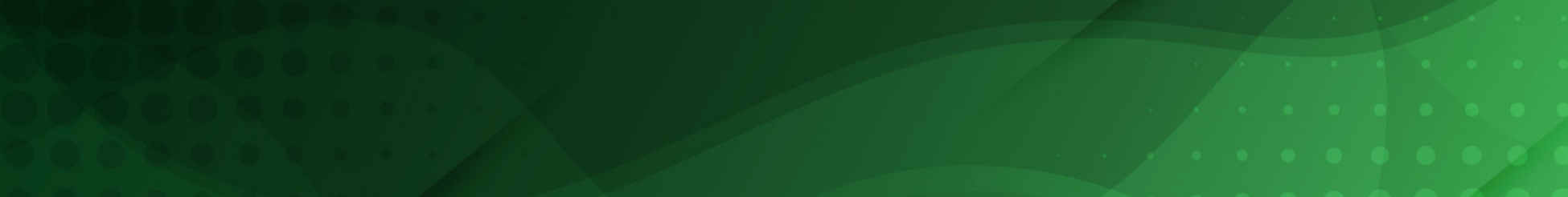
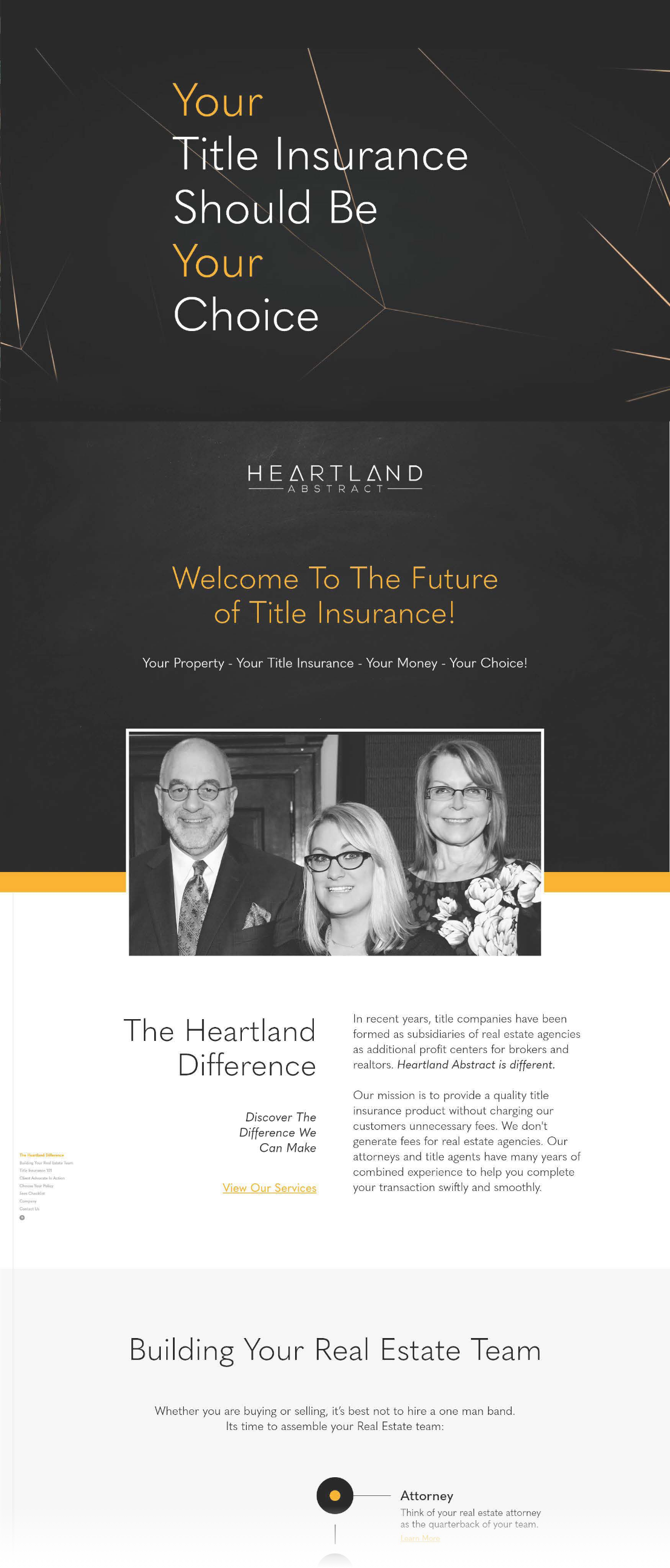
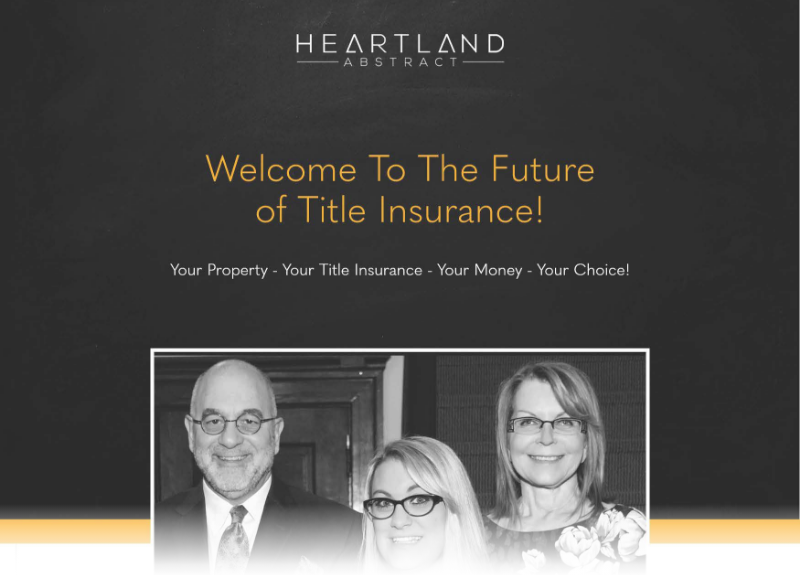
I began the design with a subtle yet confident introduction to the purpose of the site. A looping background video immediately draws the visitor in, reinforcing the core message: you have the power to choose. From there, the user scrolls into the heart of the site-why Heartland Abstract is the right choice. The overall aesthetic leans into a high-end, editorial feel, similar to that of a premium lifestyle magazine. Most of the content lives on the homepage, either presented directly or revealed through interactive dropdowns that expand on key topics. A vertical sidebar navigation adds a unique touch, allowing visitors to easily explore the content without feeling overwhelmed.
The development of Heartland Abstract was a challenge I was genuinely excited to take on. I set out to create a site that not only looked like a high-end magazine but also kept users engaged-even when dealing with something as dry as title insurance. As users scroll, text elements animate into view to maintain momentum and focus. The side navigation updates dynamically, with color changes signaling their position on the page, and small contrasting hover states add a layer of refinement and interactivity. The bold top message and animated background disappear as users scroll deeper, allowing the core content to take center stage. I especially loved this project because it gave me the opportunity to lean into interactive elements-something I believe makes a website feel truly alive.
While Andrew's bold vision combined with my creative execution led to a visually striking website, we made some important changes post-launch to better serve the site's SEO goals. The introductory message and background video were removed, and a more traditional navigation system is being implemented. We're also transitioning all dropdown content into separate pages to improve search visibility. These updates were a valuable reminder: even if you build something the client loves, long-term success depends on how well the site performs for the people using it. A great website isn't just about design-it's about aligning creativity with strategy.
Currently:
I continue to provide updates and ongoing support for Andrew's website, ensuring it stays current, functional, and aligned with his evolving business needs.
I thrive on tackling exciting challenges and pushing the boundaries of design and development. With an insatiable appetite for learning, I'm always exploring new ways to innovate and deliver groundbreaking results. Whether it's redefining a company's online presence or crafting a bold new visual identity, I bring creativity, percision, and passion to every project.
If you're looking for someone who can transform ideas into exceptional realities and contribute meaningfully to your team, let's connect. Together, we can create something extraordinary.